
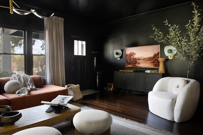
For decades, real estate stagers and conventional decorating manuals preached a single, rigid commandment for small spaces: paint them white. The logic appeared bulletproof on the surface. Pale surfaces bounce natural light, create an illusion of expansive airiness, and push walls outward visually. In practice, however, applying stark white or pale gray to a compact room starved of natural daylight often backfires. Instead of feeling open and bright, the space reads flat, chilly, and uncomfortably sterile—like an overcast day trapped inside four drywall corners.
Designers have increasingly abandoned this rule in favor of an approach that leans directly into spatial reality. If a small powder room, den, or entryway is naturally dim, fighting the shadow is an uphill battle. Embracing deep, moody shades allows a tight room to shed its cramped feeling and take on an aura of deliberate luxury, depth, and intimacy. The difference between an atmospheric retreat and an oppressive, cave-like enclosure does not hinge on how dark the paint is, but on how you manipulate undertones, sheen, lighting, and perimeter boundaries.
Decoding Undertones and Light Reflectance Value
Before choosing a swatch, understanding how paint interacts with room volume begins with Light Reflectance Value (LRV). Measured on a scale from zero to one hundred, LRV indicates the percentage of light a color reflects rather than absorbs. Deep charcoals, ink blues, and forest greens typically sit below fifteen on the LRV scale. They do not bounce incoming sunlight; they swallow it.
Because these pigments absorb light, flat, one-dimensional dark shades can easily turn muddy in small spaces. Pure black or generic industrial grays frequently suck the energy out of a room because they lack chromatic complexity. The solution lies in choosing shades enriched with complex undertones that react dynamically to shifting ambient conditions throughout the day.
A blackened navy that carries a hint of slate green will appear grounded and serene in the morning, then reveal rich nautical depth under warm incandescent lamps at dusk. An aubergine with smoky brown roots reads cozy rather than dramatic, providing warmth that keeps dark corners from turning ominous. When evaluating color chips, hold them directly in the room’s darkest corners under natural morning light, midday sun, and artificial evening lighting to verify that the undertone stays vibrant rather than dying out into flat gloom.
The Boundary-Erasing Magic of Color Drenching
The single most common mistake homeowners make when painting a small room a dark color is leaving the ceiling, baseboards, and window trim bright, builder-grade white. While high contrast might seem like a reliable way to frame and brighten a space, it achieves the exact opposite in tight quarters.
Every time the eye meets a sharp white line running along a dark wall—whether at the crown molding, door casing, or baseboard—the brain registers a hard boundary. These harsh visual intersections map out the physical perimeter of the room with unforgiving precision, reminding the occupant exactly how close the walls and ceiling truly are.
To neutralize this perceptual cage, employ color drenching. This technique involves painting the walls, trim, doors, baseboards, and even the ceiling in the exact same deep hue. When the entire envelope shares an identical pigment, architectural corners visually soften and recede. The ceiling line ceases to be an abrupt visual stop, tricking the eye into perceiving infinite depth. The corners blur together, making the true perimeter difficult to pinpoint. Far from shrinking the volume, drenching wraps the room in a continuous, enveloping cocoon that makes boundaries practically vanish.
Selecting the Right Sheen for Visual Depth
Paint finish plays an equally critical role in preventing a moody room from feeling flat or suffocating. While dead-matte paints are popular for concealing drywall imperfections, painting every surface of a small, dark room in a completely matte finish absorbs light so thoroughly that walls lose their dimensional texture.
Instead, create visual balance by varying the sheens across different planes:
-
Eggshell or velvet matte for wall planes: A low-luster finish retains a soft, chalky sophistication while providing just enough surface resilience to capture subtle ambient reflections.
-
Satin or semi-gloss for millwork and doors: Applying a slightly higher sheen to interior doors, wainscoting, and baseboards introduces textural contrast without requiring a different color. As natural or artificial light sweeps across the millwork, the subtle gloss highlights architectural detail, carving out three-dimensional relief against the flatter walls.
-
High-gloss ceilings for dramatic vertical lift: In rooms with low ceilings, a lacquered or high-gloss ceiling painted in the same dark hue acts almost like water at night. It captures lamplight and reflects shapes from below, effectively doubling the apparent height of the room.
Building a Multi-Tiered Lighting Plan
A dark room will only feel like a dungeon if it is lit like one. Relying exclusively on a single central flush-mount ceiling fixture is a surefire way to cast severe downward shadows and expose unflattering wall textures. To make dark paint look intentional, lighting must be layered horizontally across multiple heights.
Warm Sconces and Eye-Level Illumination
The most flattering illumination in an intimate, dark room sits between eye level and waist height. Wall-mounted sconces—particularly those featuring fabric or frosted glass shades that diffuse light outward—cast warm pools against dark wall finishes. Pair them with table lamps on consoles or desks to distribute points of glow across the room’s perimeter rather than blasting light downward from above.
Kelvin Temperature Matters
The color temperature of light bulbs makes or breaks a dark color palette. Cool daylight bulbs clashing violently with moody pigments create a clinical, institutional cast reminiscent of an interrogation room. To bring out the richness of deep blues, dark olives, and velvety charcoals, choose bulbs in the 2700K to 3000K range. This warm spectrum replicates the comforting quality of candlelight and golden hour, softening shadows and highlighting the nuanced undertones of the wall color.
Balancing Weight with Reflective Accents and Organic Textures
Deep paint colors provide a dramatic backdrop, but the furniture and decor placed against them dictate whether the overall atmosphere feels cozy or heavy. To keep a compact room balanced, integrate materials that provide tactile counterweights to the walls’ visual gravity.
Incorporate specular accents such as unlacquered brass, brushed bronze, antiqued nickel, or beveled mirrors. A well-placed decorative mirror on a dark wall serves double duty: it visually punctures the wall plane like a faux window while catching lamplight and scattering it back into the center of the space.
Balance the visual weight of dark walls with organic warmth. Natural woods—such as walnut, white oak, or honey-toned teak—prevent dark colors from feeling sterile. Layer in tactile textiles like textured linen drapery, nubby bouclé, warm wool throws, and ribbed ceramics. These materials introduce natural highlights, cast delicate micro-shadows, and provide physical comfort, ensuring the finished environment feels inviting, grounded, and thoroughly intentional.